Throughout time, the meanings which we have long associated with certain typefaces and fonts have gradually changed, and in many ways stayed the same. Novatype is a place to explore these changing meanings, having a focus on both the history and modern-day uses of fonts. This was the rationale behind my blog; for each article, focus upon one font or typeface, explore their history and gradually begin to talk about their place within the modern world. Within Novatype, a future-facing perspective is essential, along with the past and contemporary meanings associated with the selected form of typography, a glance into the future of these fonts is something that each article discusses.
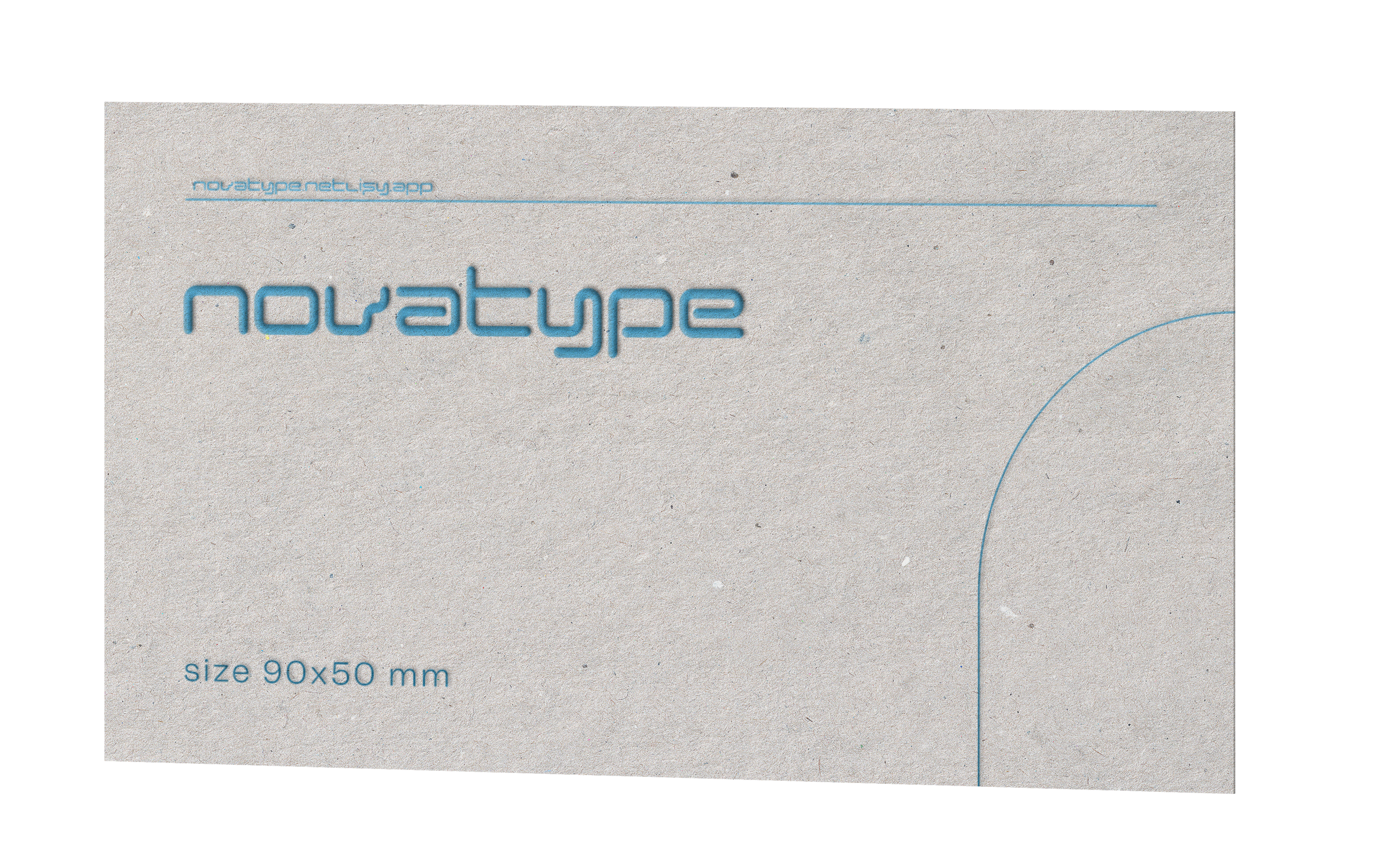
This sense of futurism and modernity is an integral part of Novatype and is intended not only to be reflected in the articles but also the design elements of the website. A consistency in this design is present all across the site, with a heavy focus on blue gradients and futuristic fonts. The Novatype logo is present within the favicon and logo space and utilises the font “Euphoric Heavy Regular.” This font is sleek, modern and futuristic and is imperative in shaping the theme of the website. The blue gradient is something that is heavily associated with futurism, with blue symbolising freedom, boundlessness and modernism, hence the association of blue with the Y2K aesthetic. For each article, the main image is designed to include these colours whilst also showcasing the discussed font, allowing a balance to be created between the idea of modernism and the often, old fonts that are being discussed. This allows space for uniformity within the design, whilst also giving each highlighted image its own individual space to stand out. In order to establish this design uniformity, I decided to create a design reference. The design reference took the form of an imagined business card for the website, in order to reflect the key aspects of Novatype, and establish its overall theme.

In terms of the name of the website, this too, was designed to reflect the sense of modernity that is present within the design. Nova stems from “Novus” a Latin word meaning new, linking to the website’s intended person, to explore type from a modern and “new” perspective, focusing on how meanings have shifted, and in some cases remained largely similar. In order to give a clear perspective on how these meanings have changed, it was essential to be able to give pop-culture related examples e.g. links to music, where possible are an easy way to showcase the importance and changing meanings of fonts to the reader, especially through the album art of famous artists, whom often help to transform the associations we give to fonts.
Overall, the goals of Novatype are clear; explore the former and modern meanings of typography and evaluate the place of these fonts/typefaces from a future-facing perspective.
