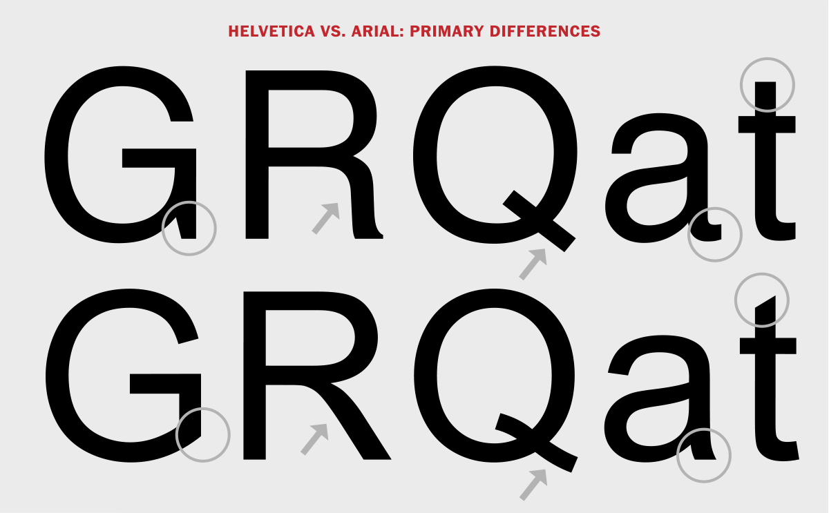
Akin to Helvetica and Times New Roman, Arial is one of the most recognisable fonts of our time. Easily accessible across a variety of platforms and programmes, Arial is often used as a default font, free of charge. But where did this cultural staple begin? 1982, to be exact, and it was created by the type foundry, Monotype. Originally made for IBM printers, the font was intended to mimic that of Helvetica, which it was designed to be metrically identical to. Akin to many sans-serif fonts, Arial was designed to be humanist, sporting low contrast between thick and thin strokes and loose letter spacing, making it more legible at smaller sizes. This was something that its basis, Helvetica was criticised for, whilst Arial seemed to excel at. Eventually the font became intertwined with Microsoft and their products, with the font being present within all versions of Microsoft Windows from Windows 3.1 onwards.

Modern Usage

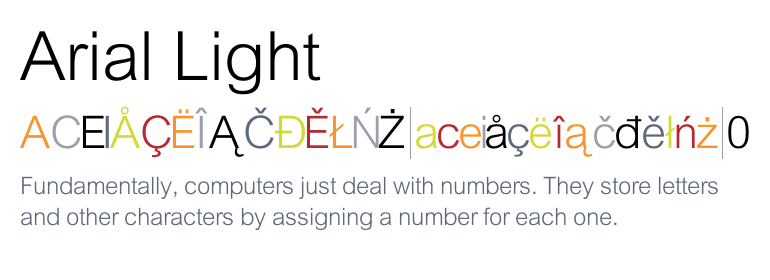
In terms of its modern usage, Arial is used in almost everything from PowerPoint presentations, to memos, videos and other basic documents. Many designers opt against using it in any “aesthetically-pleasing” sense of design, as Arial is often frowned upon by the community. It is best saved for any application where design sensibilities are not of major importance. Whilst these criticisms have arisen, Arial still is an important cultural staple, and is a great option for body text. It also has a global influence, with the font being available in a variety of different languages and scripts. Arial is no longer just associated with Windows either, it now comes packaged within Apple’s Mac OS X operating system, expanding its cultural capital, and operating as one of the default fonts. Arial’s prominent position within the world of typography has been cited to be one of convenience, rather than general appeal. However, this aforesaid accessibility can be seen as an advantage too, cementing its place within our collective memory. Arial is an evolving font, much like Helvetica, with its most recent variation, “Arial Nova” being released alongside Windows 10. The typeface also has many variations such as Arial Regular, Arial rounded, Arial Light etc. In total, there are over 28 styles of the typeface. This only cements Arial’s place in the modern landscape, each of its typeface styles have their own unique usages, for example Arial Black evokes a different meaning to let’s say Arial Light. Arial Light evokes a sense of futurism and modernity, whilst Arial Black evokes a sense of vibrancy and importance, a great choice for Magazine Covers or Titles.
The Future of Arial
But what does the future of Arial entail? This question is rather divisive, with many still seeing Arial as a bad mimicry of Helvetica. However, I feel it is fair to say that Arial has its own identity from Helvetica. The typeface is imprinted within our collective consciousness and it is the first option many see on applications such as Google Docs. It is great for personal work, that is not intended for the realm of graphic design etc, and is a great choice for body text due to its readability. It is also constantly evolving, often alongside Microsoft Windows and the release of their various products. In a world of instant gratification and expected rapidity, the ease of accessibility surrounding Arial is perhaps a sign of a bright future. Convenience, especially nowadays, is more important than ever, and the ever present nature of Arial fulfils this need. Criticism of the font will always exist with many designers seeing it as the bane of their existence. Some feel its time has passed, claiming that Arial was often chosen due to its cheapness, and not its design. This is somewhat true, but cheapness is an important factor when we consider what somebody desires. Many do not care whether a typeface is considered banal and trite, they want something that is easy as well as cost-effective. The debate around Arial indicates that the typeface still generates much interest, and this is the ultimate proof of its ongoing relevancy. The humanist, sans-serif typeface clearly resonates within a modern world, and the controversy surrounding it is merely a testament to its continued future.
