Perhaps one of the most recognisable fonts of our time, Helvetica, and its many variations are widespread across society. Even if the name does not seem familiar, exposure to the font is ever present, through government produced media to magazine publications. In terms of the typeface’s origins, Helvetica was originally named Neue Haas Grotesk (New Haas Grotesque) but was later renamed after the Latin word “Helvetica’’ meaning Swiss, having been created in 1957 by Swiss Type Designer, Max Miedinger. The font was designed to be seen as neutral and modern, a sans-serif that would be easily adaptable within the Swiss market. The typeface’s popularity began to boom when it was made available for phototypesetting systems, as well as many other formats such as Letraset dry transfers and plastic letters. Soon, the typeface would be licensed to Xerox, Adobe and Apple, becoming a core typeface available on devices and software that these companies would create. With this expansion, Helvetica managed to create a greater sense of cultural capital due to its ease of access.

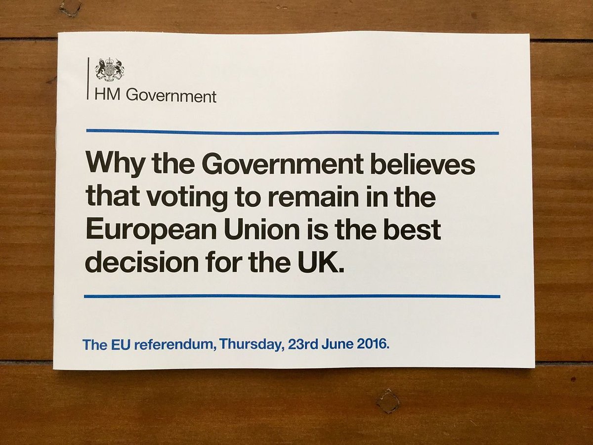
In terms of modern functions, Helvetica serves its purpose well, it is eye-catching, clear and easily-visible, the lack of serifs only add to a feeling of modernity and clarity. Its distinctive legibility and eye-grabbing nature has made it a staple across a variety of formats. It is often used on street signage in cities such as Chicago, government leaflets from GOV.UK as well as movie posters and company logos. The typeface is clearly adaptable to a variety of uses, and it’s fair to assume it has a firm place with 21st century society. But what adds to its sense of modernity and brilliance? First of all, the typeface’s x-height is an important factor, allowing it to be read from longer distances than traditional fonts would. Tight-spacing between letters also adds to this feeling of modernity, it is compact and makes the maximum use out of the space it has. Finally, it has a sense of uniformity which makes the font feel consistent, it’s capital letters are wide but the same size. This aforesaid width of the capital letters within this typeface cannot be understated as a factor in it’s attention grabbing nature. On the contrary, the font does have a primary weakness, and that is its lack of legibility at small sizes. This makes it largely unsuitable for small body text as the large capital letters often curl back into themselves, making the font seem too compact. This weakness is justifiable however, as the font was never really intended to be used at small-sizes, it is meant to be histrionic in its usage.

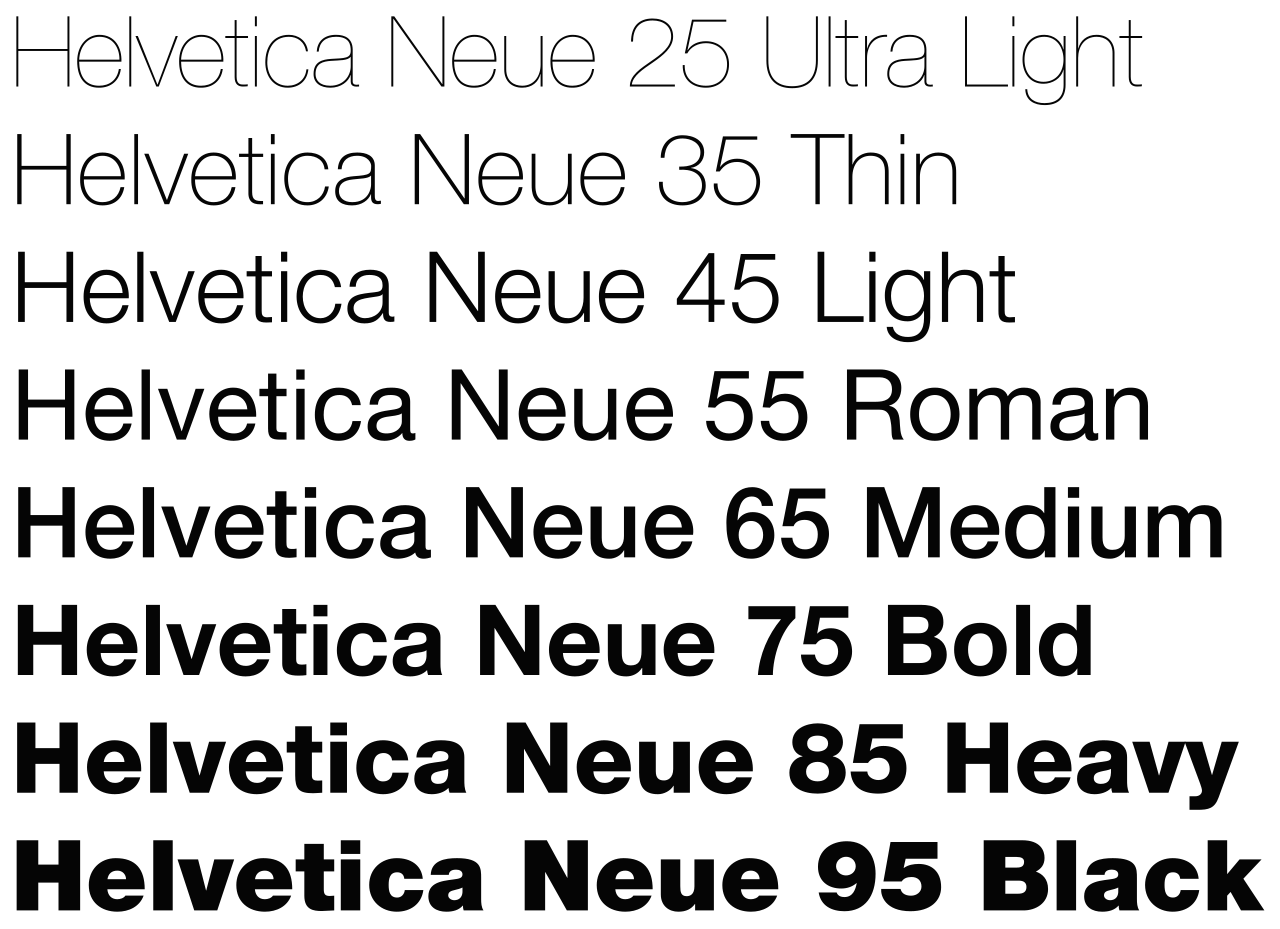
So what is the future of Helvetica, now that it is well-placed in contemporary society? Helvetica is constantly evolving, with many different versions of the typeface being produced across the years. One of these evolutions is the Helvetica Neue typeface, which improves legibility and offers a huge variety of font-sizes ranging from ultra light to black. Each of these font-weights all carry their own unique sense of identity, and as a result the popularity of this typeface has surged, with Helvetica Neue Bold often being used on the cover of publications, one such example is PAPER Magazine. Other versions include Neue Helvetica World which has improved global accessibility of the font, adapting it to languages such as Latin, Hebrew and Thai. This shows the global appeal of the font, it is not just popular within the western world. Evolution is constantly occurring for this font, with its most recent version being developed in 2019, one can only expect further developments to occur. Helvetica has an established place within society, so much so that official governmental organisations such as GOV.UK have utilised it within their media formats. This is a testament to just how commonplace it is, it is almost considered the standard when someone wants a font that is bold, attention-grabbing and legible from a distance. Helvetica is unapologetically modern and a perfect fit for the modern-day attention economy we are living in, allowing people to read it fast and from a distance, conveying strong meanings through its emphatic appearance.
