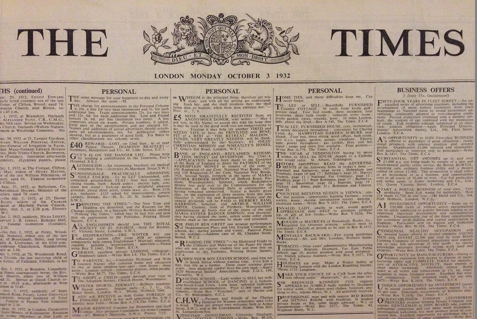
One of the most recognisable fonts around, Times New Roman has never truly faltered with the passage of time. Having been created by Stanley Morrison and Victor Lardent when commissioned by the London newspaper “The Times’’, the aim of the font was to be as print economic as possible. The main goals of the font’s creation was to maximise the amount of type that would fit on a page. The second, and equally important goal was to be easily readable, both of these goals would prove a success. Despite the diminishing value of print in modern-day society, Times New Roman is still widely used, primarily due to its ease of access, associated meanings and inclusion in most modern day word processors.

The aforesaid “ease of access” that comes with Times New Roman cannot be understated. Microsoft included the font in every version of Windows from version 3.1 and for a while it was used as the default in many word processors. From this perspective, much of the popularity associated with Times New Roman comes from the fact it is seemingly an easy option, it is free to use, comes with most operating systems and is often required in certain job sectors. For a long time, Times New Roman was the required font in the legal profession, with many firms enforcing its usage throughout their documentation. In terms of the associated meanings that are tied to the font, a certain element of formality is definitely an established one. The inclusion of serifs already add a more “bourgeois” feel to the font, creating a sense of the ornate and adding an elegant touch that sans-serif fonts sorely lack. Another meaning that cannot be forgotten, is a contextual one, one of “familiarity.” Due to the constant presence of Times New Roman across both the print and digital realms, it has slowly and steadily become a familiar motif within our lives. It is something that has been used for decades, it is trusted and deemed safe to use, it isn’t risky or experimental, and is now, perhaps, part of the status quo.
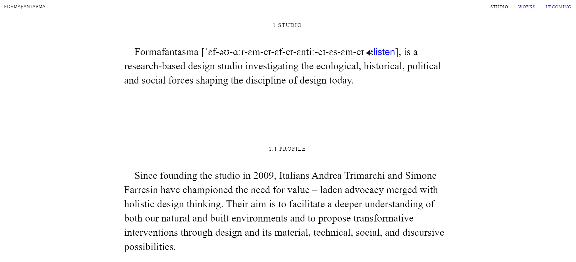
This meaning has been cemented over time, but older ones have been reiterated in our modern landscape. The growing concern over the environmental impact of technology has highlighted the meaning for Times New Roman’s creation; to be sustainable / to take up as little space as possible in the printing era. Now, in the digital era this meaning has been reiterated, in order to tackle the aforesaid environmental concerns regarding technology. Times New Roman, along with Arial, have been cited, by fastcompany.com, to be the world’s most sustainable fonts. They are default fonts, and therefore, they take up less bytes than say, a custom-installed one would. The HTTP requests for these fonts are smaller, and take up less data. The aim is to use the minimum amount of energy and storage space as possible, in order to reduce one’s carbon footprint. Although minimal impact is really made from these minor changes, considering the increased focus on environmental concerns, perhaps this reiterated association with the font will become increasingly important as time goes on. It’s clear some are adopting this idea, for example, Amsterdam-based design studio Formafantasma, has a newly redesigned website that’s better for the environment, primarily utilising Times New Roman to accomplish this goal.

Yet, with the long-period in which the font has been around, criticisms have emerged. Some believe that Times New Roman is an unexciting, boring choice, that it is nothing but trite. Some have been warned against using it on their CV’s, with Brian Hoff, creative director of Brian Hoff Design, stating :“It’s telegraphing that you didn’t put any thought into the typeface that you selected.” But others appreciate the convenience and commonality of the font, with writer Ian Rankin expressing his preference for the font, stating “it’s the first one that comes up … and it is easy on the eye.” The main point of contention seems to encircle this aforesaid meaning that is often associated with it, “familiarity”. Some clearly see this familiarity as a hindrance, for them it is a reflection of a font that has been long overused and thus, should be avoided at all costs. But others appreciate the convenience, it is easily accessible and allows one to avoid the complicated question of choosing an appropriate font. Ultimately, like most things, it is up to personal preference, do we prefer convenience, or do we want to stand out from the crowd? Overall, though, it is clear to see that Times New Roman still holds an important place within modern society, as seen by the many articles discussing its history and explaining its popularity. Of course there is great debate surrounding it, but this is a consequence of its popularity, and is a healthy sign of relevancy. Debate requires interest, and for Times New Roman, it seems that this source will not be running out anytime soon.
