The history of the Blackletter typeface stems back to the 12th century and was approximately used until the 17th throughout western Europe. Whilst this typeface comes in a variety of forms and fonts, it is easily recognisable, with its intricate, extravagant design with a dramatic contrast in font-weight. What has to be noted is that the Blackletter typeface was initially, and still is, largely associated with quality and wealth.
This association likely originated from the almost exclusive nature of the typeface, it originated from the previous typeface Carolingian and was easier to mass-produce. In the beginning, it was mostly used for academic books, which needed to be produced for universities. As we know, at the beginning of blackletter’s rise in popularity, literacy rates in Europe were still poor, so the ability to read was seen as a luxury. Whilst simply one perception, this could be seen to have added to the wealth and quality surrounding the typeface, it was used in prestigious texts, often only available to those who had the financial capacity to learn how to read.
Transition to modernity
Gradually, the blackletter typeface began to be used less and less, as serifs, and later, sans serifs became commonplace within literary society. Yet, the typeface still had its place within society, still being used within Germany until the 1940s. In contemporary society, however, like many fonts, its meaning has shifted and in some ways, remained largely the same. With the rise of rock music, often associated closely with a darker sense of style, the blackletter typeface has become largely associated with certain bands. This makes a lot of sense, the blackletter typeface is by definition, a gothic font.
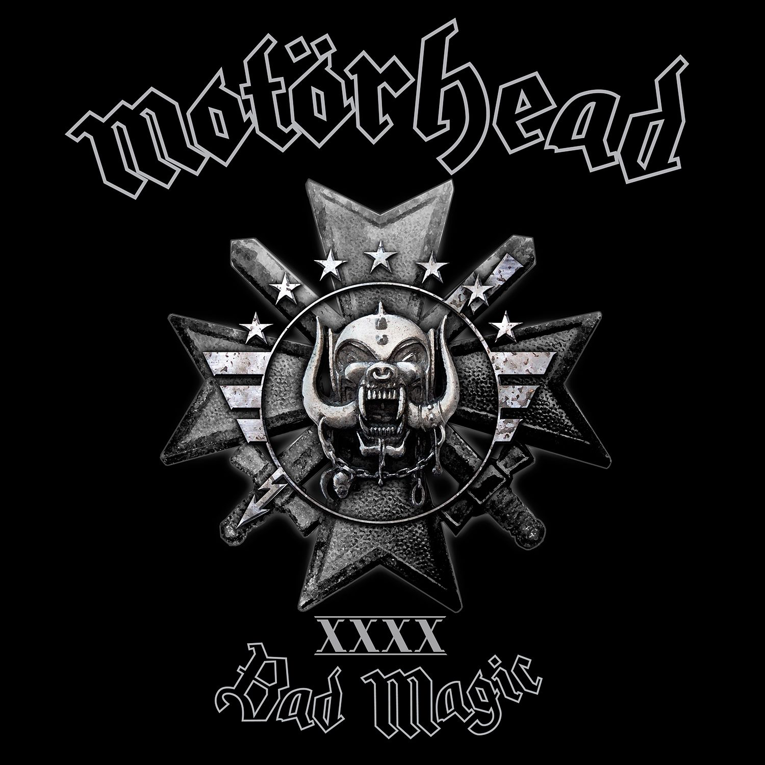
And, as said in the book “Rockin’ Out: Popular Music in the U.S.A” - “the use of umlaut marks and other diacritics with a blackletter typeface is a form of foreign branding which has been attributed to a desire for a “gothic horror” feel.” What is interesting to note, is that the Germanic connotations of the font have also fed into the gothic image surrounding it, they are heavily interlinked, being movements that both originated in Europe. Rock bands such as Motörhead are well-known for utilising this typeface throughout their branding, to convey these meanings.

Whilst rock bands convey the meanings we typically associate with the font, so has another genre. Rap music, especially during the late 90s and early 2000s, began to use the font, primarily on album covers. One of these reasons is primarily due to the image of wealth that is closely associated with the rap scene. Rap-lyrics often include references to wealth and are often used to brag about financial power. It is only logical that the typeface would need to match this meaning, and thus blackletter comes into play. With its intricate design, a contrast in weight and a long-standing connotation of wealth stemming all the way back to the 12th century; it is a clear and perfect choice.
With the passage of time, however, new meanings have been created. For example, the blackletter typeface has become associated with newspapers. Whilst the image of prestige and wealth has already been mentioned, the association with newspapers has almost become a meaning in itself. Whenever one sees the Blackletter typeface, one can’t help but think of the prestigious publications associated with it, The New York Times, The Los Angeles Times, The Irish Examiner, and many more. A good example of this comes from Taylor Swift’s album cover for “Reputation” which utilises the font to build upon the main theme of the album, being wrongfully portrayed by the media. However, due to the passage of time, the font has also been associated with antiquity, and even romance, perhaps due to its association with the time at which William Shakespeare was active. This association with Romance has been showcased through the covers of many albums, such as Halsey’s “Hopeless Fountain Kingdom”, Camilla Cabello’s, aptly named album “Romance” and Kacey Musgraves’ promotional material for her new album about failed love, “Star-crossed.”

The blackletter typeface is the true definition of longevity, adopting new meanings through the passage of time, whilst also retaining old ones. This typeface truly has managed to create a great balance between the past and contemporary society, it manages to retain a stylised and unique look whilst still looking fresh, fitting into the modern typographic landscape, through its presence in rock, pop and rap. This feat should not be understated, as it is a prime example of a typeface that has managed to smoothly transition from an antiquated world to a modern, contemporary one.
